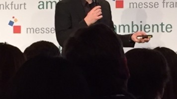
Scott Henderson’s design work has already been accoladed in the past, in the best lists of the New York Times and the I.D. magazine, among others. It has also won numerous awards, including the Design Plus Award, the Good Design Award and the IDSA Industrial Design Excellence Award. Top Fair spoke to Scott Henderson about his work.
 Could you explain the concept of the Seashore Galore for upcoming partner country USA presentation?
A consistent theme in my product design work is to create a sense of lightness through the product’s point of view. A crisp freshness. If someone tells me that they think a design of mine is very fresh, I’m quite pleased. Adjectives like cutting edge or modern are not so much my objective. The word fresh to me evokes connotations of health and happiness – lightness as opposed to burden – the feeling of rebirth and inspiration to move forward. Clever is an equally nice word. Clever can be defined as ingenuity combined with a sense of wit – the very essence of my design philosophy. To stop once the primary goal of solving a physical problem is achieved is to miss an opportunity to effect positive change on levels that extend well beyond the physical. My ultimate goal through design is therefore to achieve “clever-freshness”.
Since Ambiente is a show about consumer goods, I thought about what products I could use as inspiration that are uniquely American but less expected than a Cadillac with tail fins. I always loved the classic and uniquely American Adirondack Chair. I usually think of them as viewed from the back, with a body of water in front of them—a classic image that inspires feelings of serenity. I think mixing iconic tradition with a fresh and clever twist is a formula for high-impact, so I decided to make Adirondack chairs that were 9 feet tall – absolutely gargantuan in scale, facing a curved wall emblazoned with an image of the sea. My display tables are abstractly representing plant life growing around these giant chairs.
I placed two classic residential mail boxes at each end of the 150 foot long exhibit, with their red flags in the up position and adorned with American flags; the only direct reference to the United States—allowing the mind to connect to the theme only through the combination of images and symbols.
What – in your opinion – is the essence of good design?
Good design involves an idea that is so embodied in the product that it becomes the total story. One big, crisp, singular thought to solve a problem, creating a memorable and iconic solution. A not-so-good design tries to get 10 or 15 little ideas to work together in harmony, creating a muddled and forgetful story. A great design demonstrates an idea that is so intrinsic and built in to the solution that no superfluous application of style, color or trend can add or subtract anything from it.
Is there any design that has really “wowed“ you?
I have been asked this question a lot, and after being an industrial designer for over 20 years, I still have trouble answering it, so I guess the answer is that I really don’t draw inspiration from the classic designs of the past.
To me, design is about observation.
If you have conditioned yourself as a designer to be acutely aware of the world around you, you will be at the right place at the right time to observe a reality that will resonate positively with a wide audience if embodied in a product idea. Finding these realities is what motivates me –it’s a thrill to discover them and build on them.
Is there any new design product that you really like?
I enjoy watching a company really innovate, and then watching the rest of the industry scramble to catch up to the innovations, because that makes people realize how important design is. If I had to think of a good example, I’d say that Joseph Joseph’s product line does a great job of shaking things up through strong concepts, great 3D brand story, and innovation.
Tell us about your latest/current project besides the Ambiente show.
I have been doing projects in consumer electronics like wearable devices, some teaching toys, perception changing consumer medical products, new housewares and some maritime transportation.
Which of your own designs do you like most?
It is a hard question because of the diversity of categories design is applied to. However, I designed a piggy bank called COINK that replaces the one-coin-at-a-time method of de-positing change through a thin slot, replacing it with a generous funnel that allows whole pockets full of change to be deposited at once. This is a funny commentary on innovation, and achieves what I was talking about when I say that one, clean, clear and big idea instead of lots of little ones, can make for an impactful and memorable story.
top fair
via topfair.de
view original content here


